Director of Design & UX | Feb. 2021 – Present
As the Director of Design & UX at Coterie, I was responsible for leading a UX design team and defining a best-in-class user experience vision and strategy for digital insurance products. I designed a first-in-class insurance product called SimplyBind which enables an agent to quote and bind small business policies using only the business name and address. I’ve also established a design system and a singular UI component library for Coterie, which has increased product development efficiency and consistency of front-end design. I worked closely with tech and product teams to understand business and user needs, define key metrics, define the design vision, and create exceptional user experiences to ensure consistency.
SimplyBind
Policy underwriting, quoting, and binding app powered by machine learning
I was the lead UX Designer on the creation of this product. I used the Design Thinking process to create SimplyBind, a policy underwriting, quoting, and binding app for small commercial insurance. SimplyBind addressed the difficulty independent insurance agents face providing quality coverage to small business owners quickly and simply.
To solve this problem, SimplyBind leverages machine learning to automate the underwriting process and reduce the time it takes to quote a policy from days or weeks to only a few minutes. I collaborated with stakeholders and developers to design a front-end user interface and experience that guided users through a simple step-by-step process, asking for only the business address and name.
By utilizing publicly available data, the app presents users with all the relevant information on the business, allows an agent to quickly verify its accuracy, and quote and bind a policy in just a few minutes.
The user-centric approach, helped me and my team create a solution that addressed the specific needs of insurance agents. As a result, in the first month of launch, SimplyBind increased its quote to bind conversion rate by 10%, which has since increased to 24% as of October 2022.
Rule Builder
An insurance underwriting tool
I designed Rule Builder to address the time-consuming underwriting process of shutting off certain geographic areas during catastrophic weather events. I collaborated with our underwriters, back end developers, and insurance stakeholders to create this intuitive interface. The design solution involved a modular interface that employs If-Then logic sentence structure to allow an underwriter to build rules quickly and easily without the help of a back-end developer. By using Design Thinking principles, I was able to simplify the underwriter’s experience and reduce the time and resources required to manage potential risks.
Insurance Agent Dashboard
Login & Account Creation
I used Design Thinking to tackle the issue of confusing login and account creation processes for insurance agents using our Agent Dashboard app. I started by empathizing with our users (insurance agents) and understanding their pain points. My research revealed that users were creating unverified accounts, causing problems for our customer advocacy team who need to quickly search through accounts to assist customers.
I then ideated and prototyped a solution that would allow insurance agents to easily login or sign up, verify their NPN, and select the type of account they needed. My solution included an account hierarchy system to simplify back-end management and improve searchability.
After testing and iterating on my design, the changes were implemented by our development team. The result was an improved user experience that saved time for both our agents and customer advocacy team.
By leveraging the Design Thinking process, I was able to address the root cause of the problem and create a solution that met the needs of our users and business.
Product White Labelling
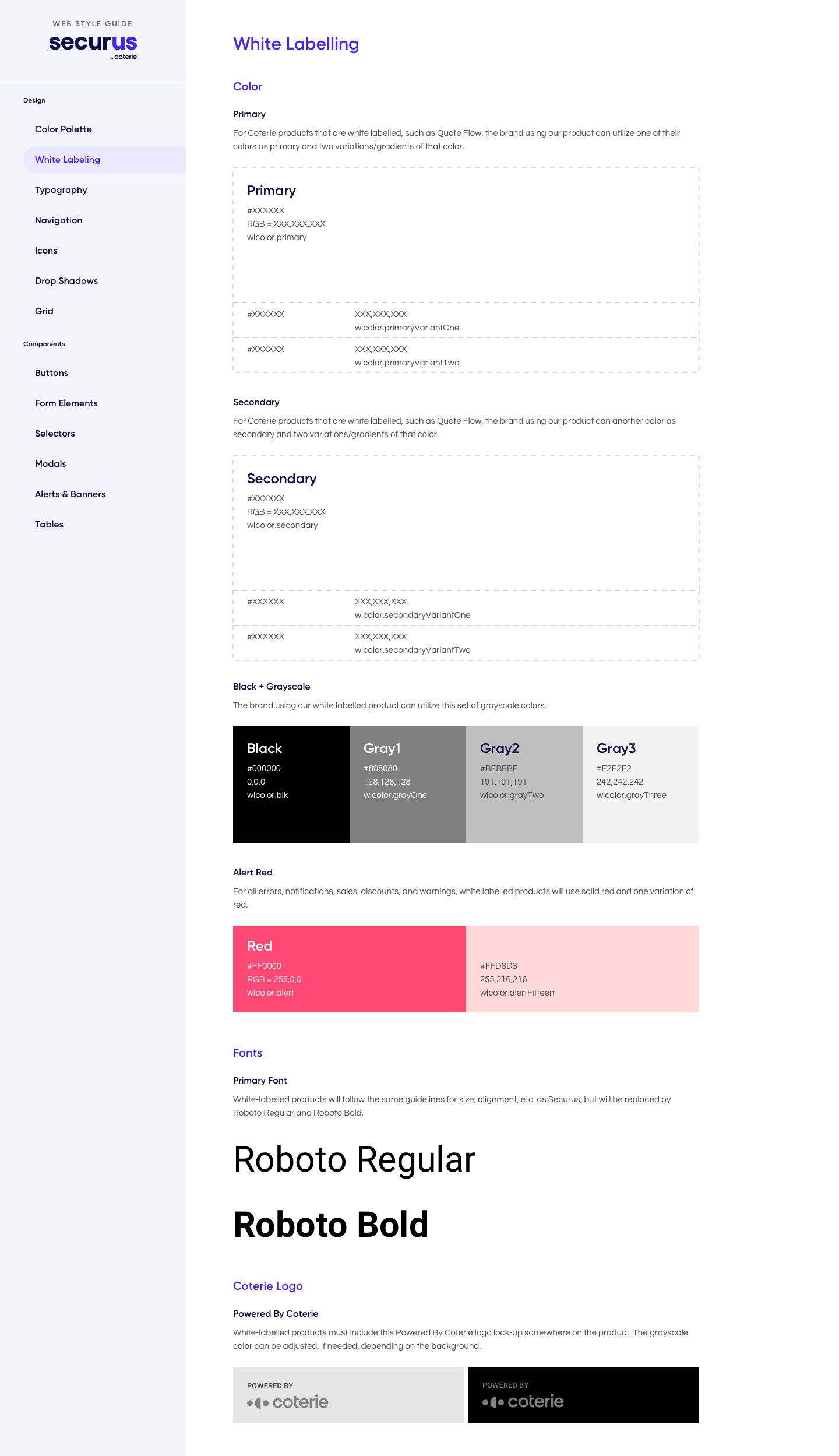
Guidelines for our design system.
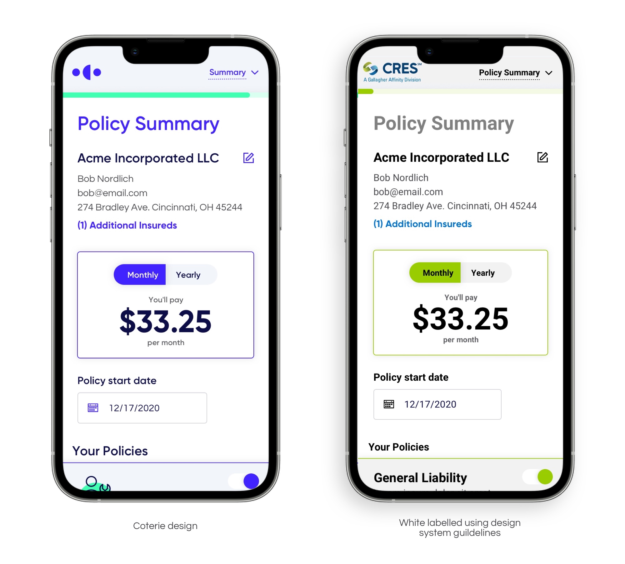
I designed a set of guidelines within our design system to enable our designers and developers to white label our insurance quoting product, Quote Flow. This was necessary as we wanted to expand the product to our B2B partners, who wanted to embed it within their own digital experiences. The implementation of white labeling was successful, and our first partner to use it was CRES Insurance.
Quote Flow
Improved Product UI
Using the Design Thinking process, I identified a common issue among our customers, who desired the ability to adjust their coverage selections on the quote summary screen. They needed to view the impact of these changes on their premium without navigating to previous screens.
To address this issue, I created flexible accordion components with toggles that provided a clear display of the optional coverages. Users can toggle coverages on and off, and their premium changes dynamically in real-time. By leveraging Design Thinking, I was able to develop an intuitive solution that met the customers’ needs and improved the overall user experience of our product.
Email Design & Personalization
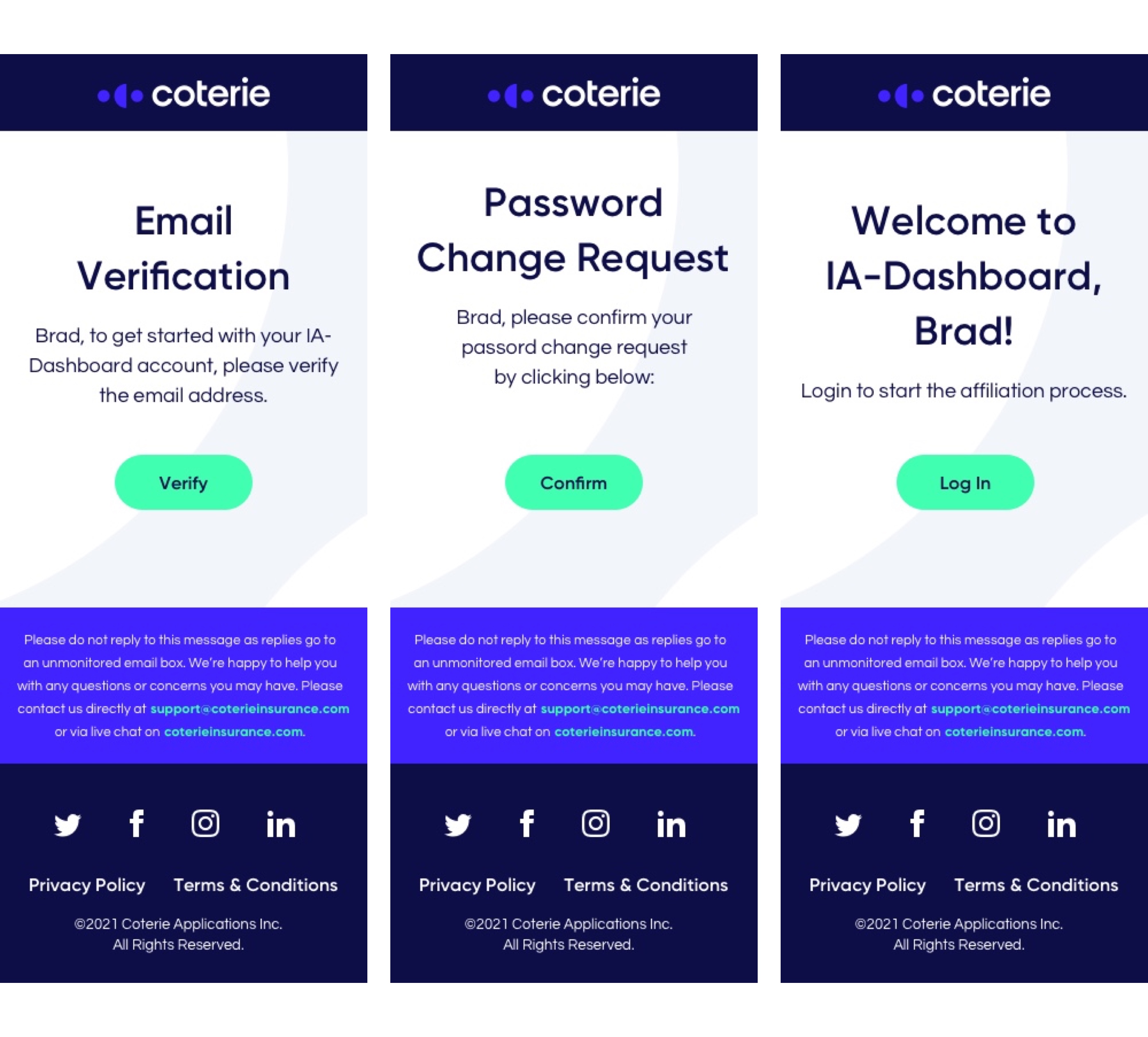
Our users were receiving plain and impersonal emails from our Auth0 account used for account creation, which led to them overlooking or disregarding these important communications. As a result, our brand was not being effectively represented.
I utilized the Design Thinking process to revamp our email communications strategy. By designing and implementing user account verification, welcome, and password reset emails for our agent Dashboard, we were able to significantly enhance the visual appeal and personalization of our emails. This approach has not only improved the user experience but also successfully reinforced our brand identity.


